🎬 Movie Booking App – UX/UI Case Study
Project Type: Concept Project
Duration: 5 Weeks
Role: UX/UI Designer
Tools: Figma
Responsibilities: User Research, Wireframing, Prototyping, Usability Testing
🧠 Overview
Booking movie tickets should be quick and stress-free but for many users, it’s anything but. From confusing apps to long lines at the theater, the experience often feels more frustrating than fun.
This concept project explores how I redesigned the movie booking process to make it faster, smoother, and more enjoyable all while keeping real user needs at the center of every design decision.
🧩 The Challenge
Booking tickets whether online or at a theater involves friction.
Online platforms often feel cluttered, confusing, and buggy.
In-person methods involve long queues, limited information, and the risk of sold-out shows.
The goal: Reimagine the booking experience through a clean, intuitive, and user-first interface.
🎯 Goals
Design a platform that offers:
A simple and fast booking process
Clear information about movies, showtimes, and seat pricing
An easy-to-use seat selection experience
A frustration-free end-to-end booking flow
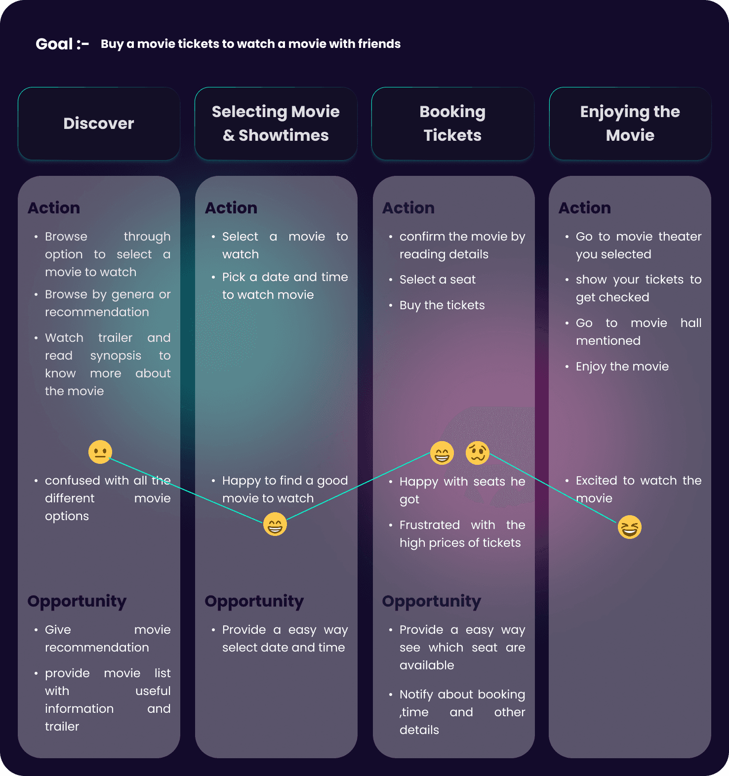
🔍 Discovery & Research
To better understand user frustrations and goals, I conducted:
User interviews
Empathy mapping
Creation of personas
User journey mapping
Key Insights:
Users had trouble finding suitable showtimes and seats
Interfaces lacked clear visual cues and feedback.
Technical glitches (e.g., freezing or crashing apps) were common.
Long waiting times at physical theaters frustrated users.
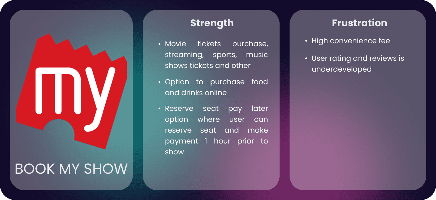
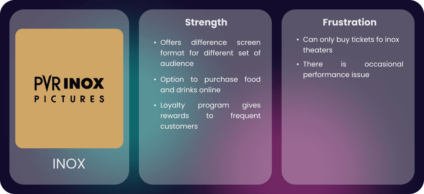
🏁 Competitive Audit
I analyzed major movie booking apps to identify strengths, weaknesses, and opportunities.
Key takeaways:
Many lacked personalization
Seat pricing was often confusing
Some had cluttered or outdated UIs
This helped identify clear areas for improvement especially in information clarity, seat selection, and user guidance.
I found out:
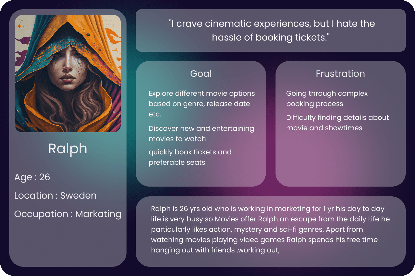
👤 User Persona
Based on my research, I created diverse user personas to represent typical users. These personas helped me better understand user goals, pain points, and expectations and ensured my design remained user-centered throughout.
🗺️ Journey Mapping
I mapped the entire user journey from discovering a movie to completing payment to spot key friction points and opportunities for improvement.
✏️ Wireframes & Low-Fidelity Prototypes
After exploring multiple layout directions, I created Lo-Fi prototypes to test core flows:
Movie discovery
Showtime selection
Seat booking
Payment flow
This allowed me to validate structure and usability early on.
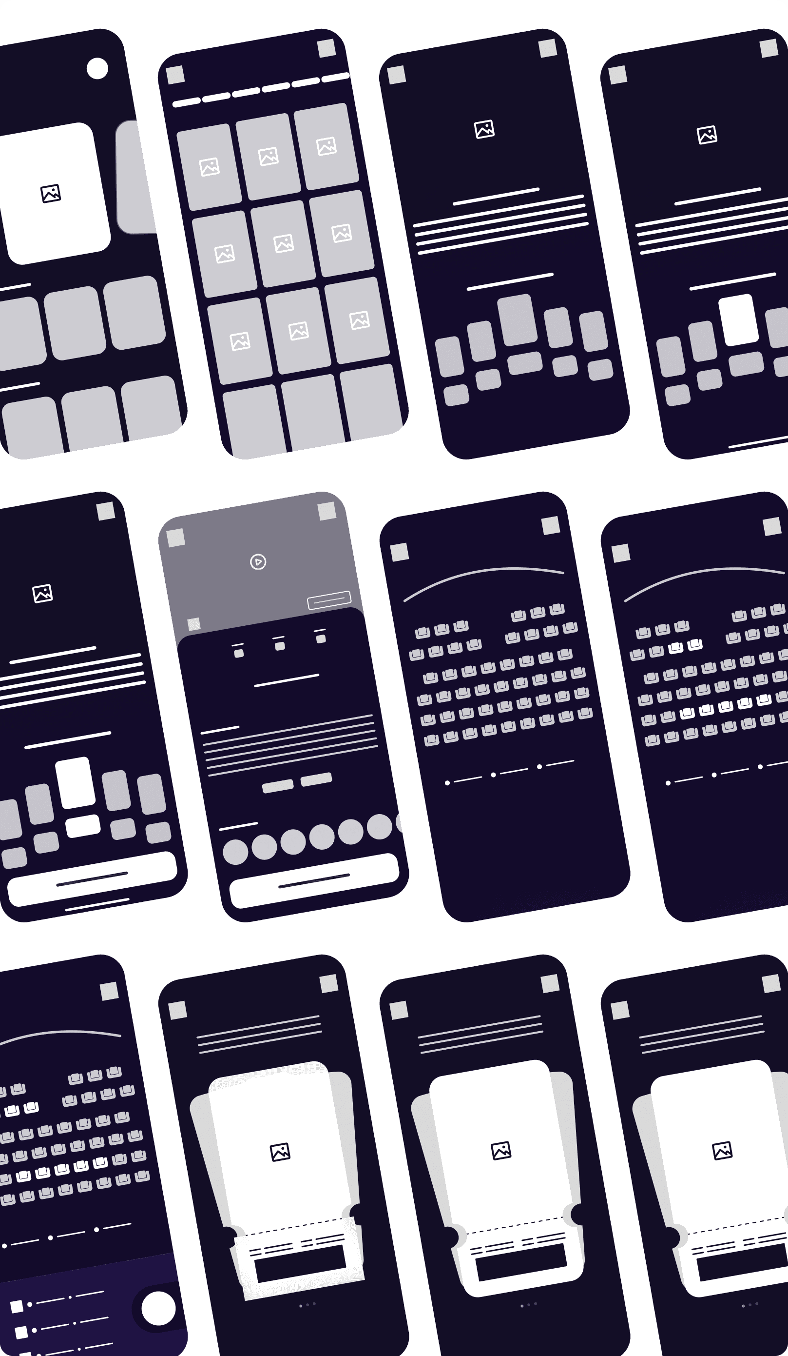
Wireframe
LO_FI Prototype
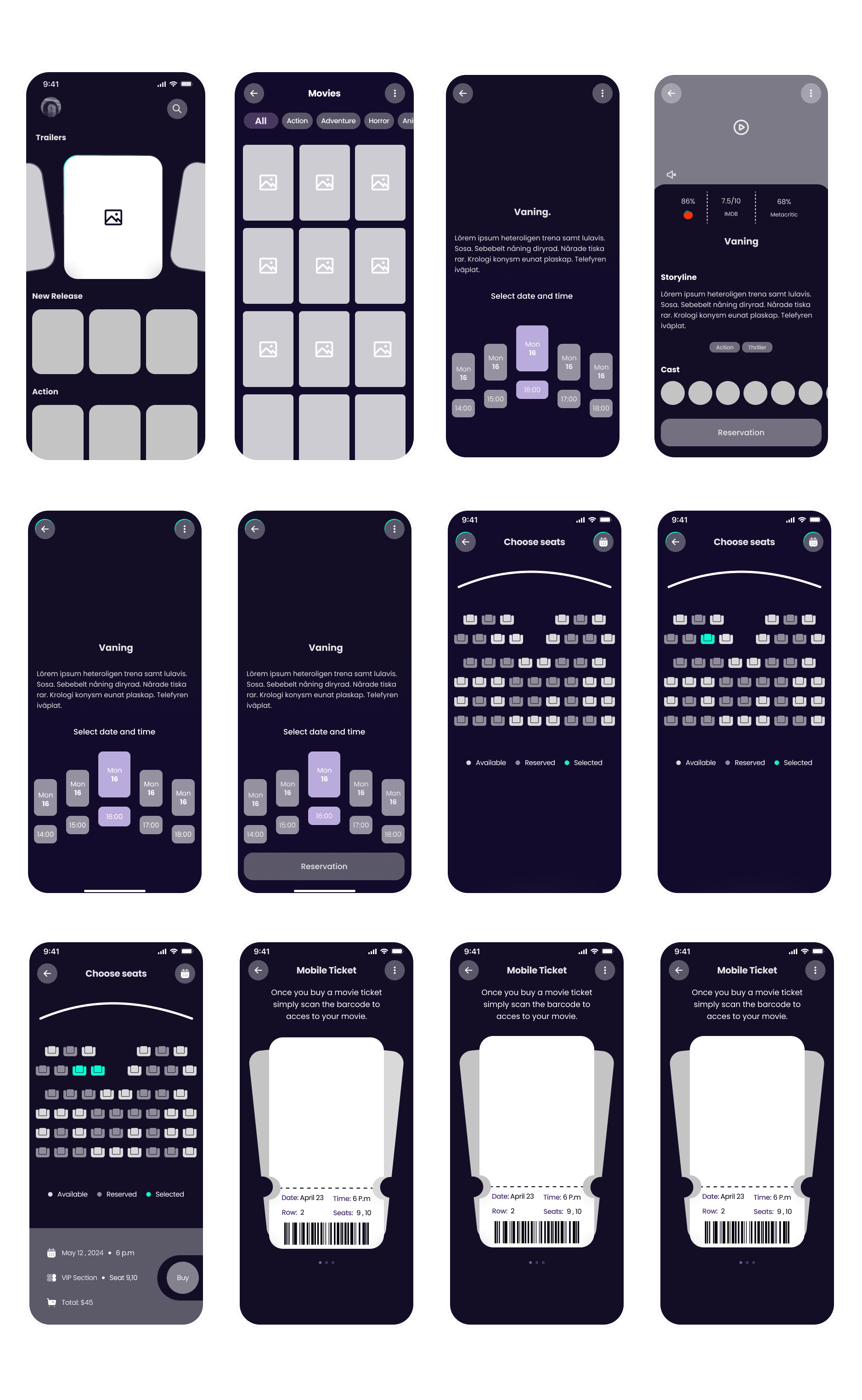
✅ Usability Testing
I ran two rounds of usability testing one on the Lo-Fi prototype, and another on the Hi-Fi version.
🧪 Round 1 (Lo-Fi Prototype)
❌ No option to select movie language
✅ Added a language selection screen before booking
❌ Missing ratings and reviews
✅ Included them in the movie detail screen
❌ No seat pricing visible
✅ Added clear price indicators for each seating section
🧪 Round 2 (Hi-Fi Prototype)
❌ Couldn’t book a single ticket
✅ Enabled single-seat bookings
❌ Couldn’t modify seat selection easily
✅ Added an option to change selected seats without restarting
Design Iteration
Based on feedback from both usability rounds, I implemented:
A cleaner and more modern interface
A more flexible and intuitive seat selection system
Clear visual hierarchy for showtimes, prices, and reviews
Language selection integrated into the flow

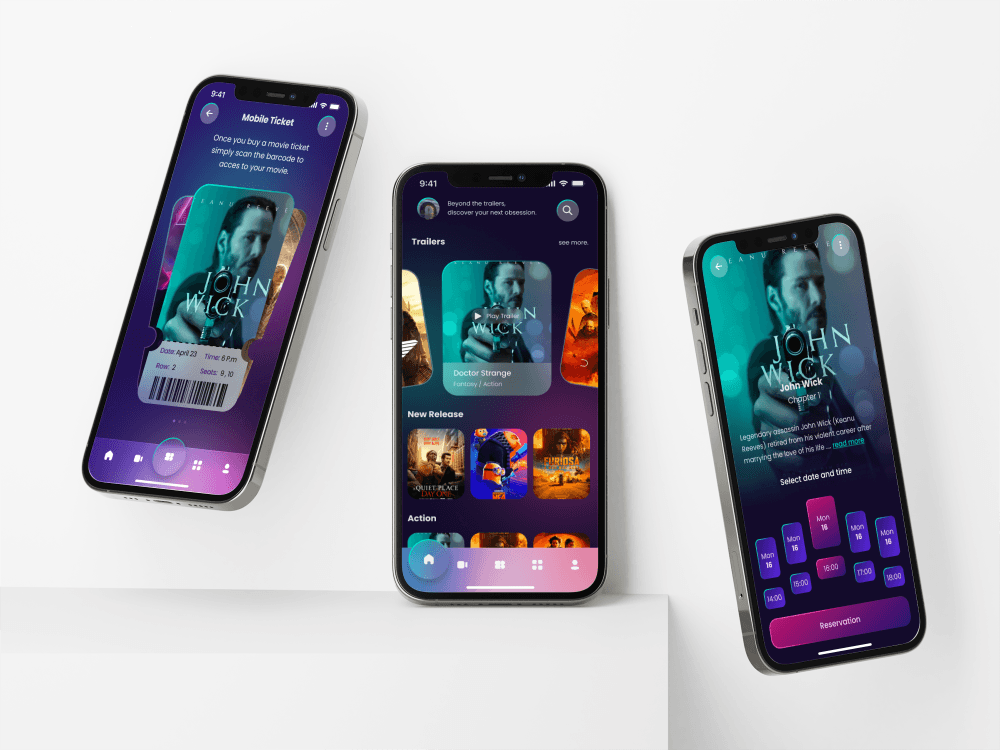
🎨 Final Design
The final prototype reflects all feedback and insights creating a refined and user-friendly experience across devices. Key features include:
Personalized movie suggestions
Trailer previews
Ratings & reviews
Smooth booking with live seat previews
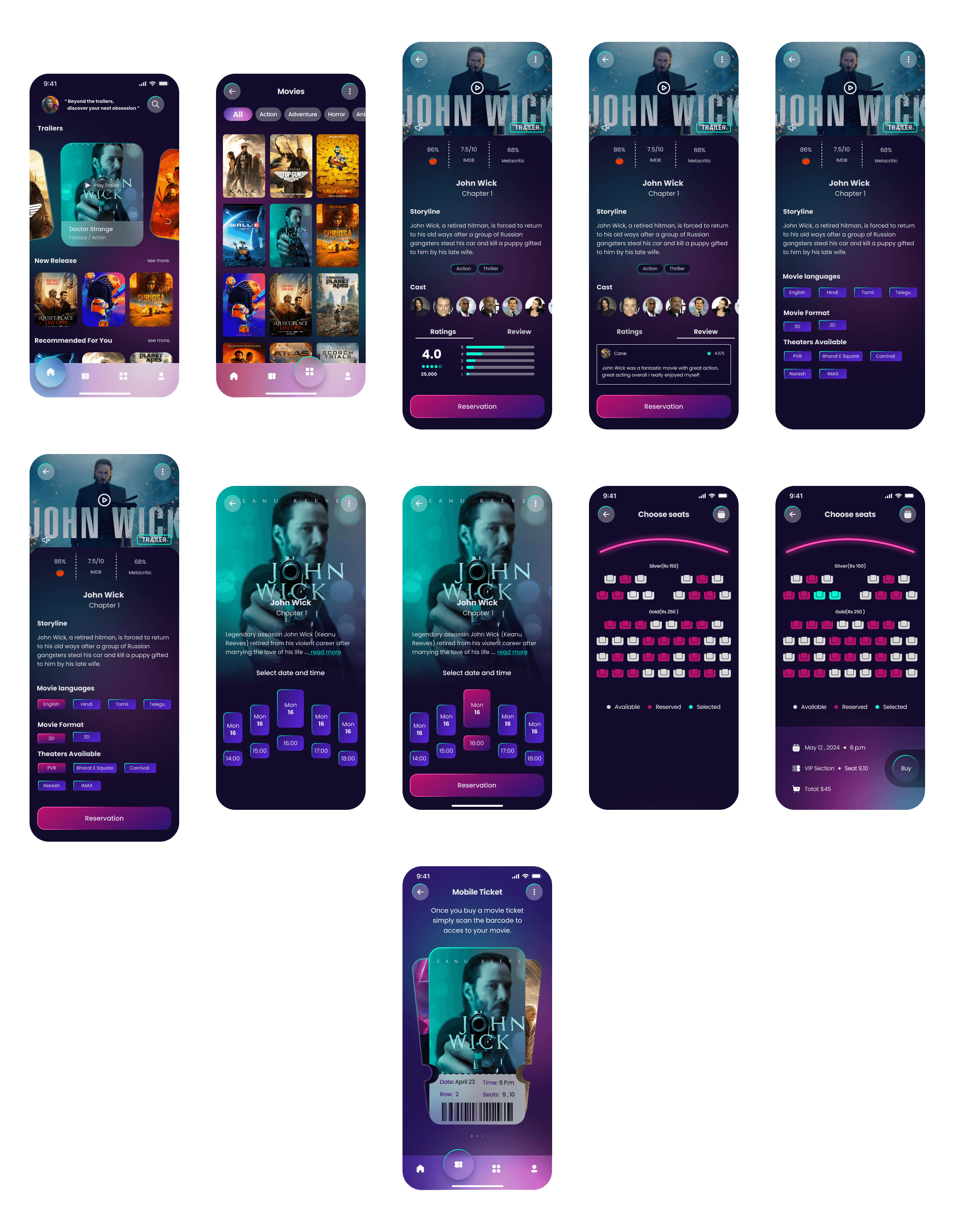
💥 Impact & Feedback :
“I love how easy it is to find movies and book tickets on this app. The interface is clean and intuitive.” – Cane
“Being able to view trailers directly from the app helps me decide what to watch. That’s a game-changer.” – Troy
📌 Conclusion
This case study reinforced the value of user feedback, testing, and iteration. By focusing on real user problems and refining based on their input, I was able to design a solution that’s both functional and enjoyable.